How to write App Store screenshot headlines, with 40 examples
The headline is the only part of a screenshot most people read. In a search result it's shown at a fraction of full size, next to other apps, for about as long as it takes to scroll past. This guide gives you a simple method for writing headlines that survive that, and 40 examples to start from.
What a headline has to do
A screenshot headline isn't a feature label. Its job is to answer the question a browsing person has in their head: "What does this do for me?" The screen below the headline is the proof. The headline is the promise.
That gives three tests every headline should pass:
- Readable at search-result size. If you shrink the slide to about the size of a postage stamp, can you still read it? That usually means six words or fewer.
- About the person, not the product. "Your" and verbs beat nouns like "engine", "suite" and "functionality".
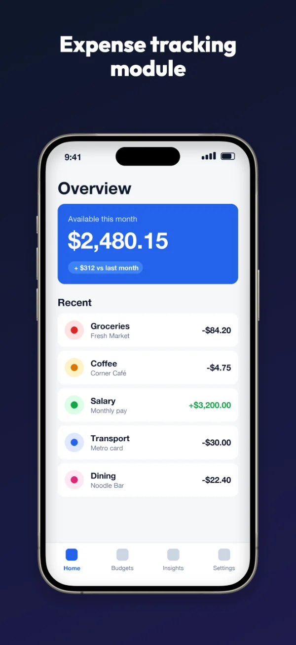
- Matched to the screen below it. If the headline says "Split bills in seconds", the screen should show a bill being split.
A four-step method
1. List what people actually do in the app
Write down the five or six things people do most, in their words, not yours. Your app-review replies and support emails are a good source. "I use it to see what I spent this week" is more useful than "spending analytics".
2. Turn each one into a result
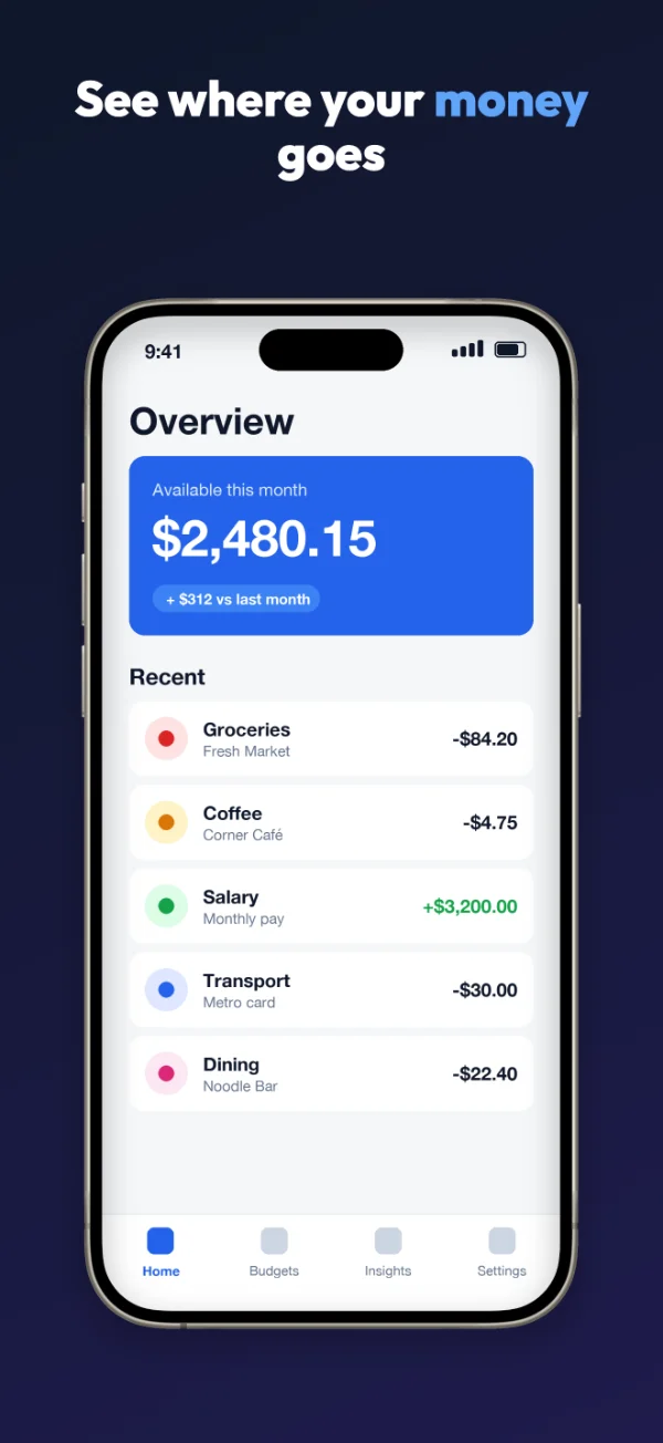
For each action, ask "so what?" until you reach something the person wants. "See spending by category" → so what? → "Know where your money goes". The second version is the headline.
3. Cut it to six words or fewer
Remove "easily", "quickly", "seamlessly" and "powerful". They add length without adding meaning. Replace vague time words with numbers where you can: "in 5 minutes" is stronger than "fast".
4. Pick one word to highlight
Choose the single word that carries the benefit, usually the result or the number, and color it. In "Know where your money goes", the reader's eye lands on "money" first. Highlighting two or three words spreads that attention thin. In the Studio, click a word under Highlight words to color it.
Five formulas that work
| Formula | Example | Good for |
|---|---|---|
| Verb + result | Plan a week of meals | Your main benefit, slide 1 |
| Result + time | Your budget in 5 minutes | Apps that save effort |
| "Your" + thing they care about | Your workouts, all in one place | Organizing and tracking apps |
| Never/no + pain | Never miss a bill again | Reminders, alerts, safety |
| Question they already have | Where did my money go? | Insight and reporting screens |
Mix formulas across a set. Five slides that all start with a verb start to sound like a list of commands.
40 before-and-after examples
Each pair shows a common feature-style headline and a benefit-style rewrite. They're written for made-up apps; adapt the nouns to yours.
Finance and budgeting
| Before | After |
|---|---|
| Expense tracking module | See where your money goes |
| Budget categories | Budgets that keep you on track |
| Bill reminder notifications | Never pay a late fee again |
| Bank account syncing | All your accounts in one place |
| Savings goals feature | Watch your savings grow |
Health and fitness
| Before | After |
|---|---|
| Workout library | A plan for every day |
| Progress charts | See how far you've come |
| Water intake logging | Drink enough, without thinking |
| Guided meditation sessions | Calm down in 10 minutes |
| Sleep analysis | Wake up knowing why you're tired |
Productivity and notes
| Before | After |
|---|---|
| Task management system | Finish what matters today |
| Cloud synchronization | Your notes on every device |
| Smart search functionality | Find any note in seconds |
| Collaboration tools | Plan projects with your team |
| Calendar integration | Your tasks and days, together |
Food and cooking
| Before | After |
|---|---|
| Recipe database | Dinner ideas from what you have |
| Meal planner | Plan a week of meals |
| Auto-generated shopping list | Your shopping list, written for you |
| Step-by-step mode | Cook along, hands free |
| Nutrition information | Know what's on your plate |
Travel
| Before | After |
|---|---|
| Itinerary builder | Your whole trip on one screen |
| Offline maps | Find your way without data |
| Expense splitting | Split costs, stay friends |
| Flight status alerts | Know about delays first |
| Packing list templates | Never forget a charger again |
Education and learning
| Before | After |
|---|---|
| Flashcard system | Remember what you study |
| Daily lesson streaks | Learn a little every day |
| Speech recognition | Practice speaking out loud |
| Progress dashboard | See your skills grow |
| Offline course downloads | Study on the train |
Family, home and social
| Before | After |
|---|---|
| Shared family calendar | Everyone's plans in one place |
| Chore assignment feature | Share the chores fairly |
| Photo album sharing | Every photo, with everyone |
| Event RSVP management | Know who's coming |
| Location sharing | Know they got home safe |
Utilities and tools
| Before | After |
|---|---|
| Document scanner | Paper to PDF in seconds |
| Password vault | Every password, safely stored |
| Unit conversion engine | Any unit, one tap |
| Widget support | Check it from your home screen |
| Privacy-first architecture | Your data stays on your phone |
A note on that last one: only make privacy or security claims that are literally true for your app. Reviewers and customers both notice when they aren't.
Words to leave out
- Rankings and hype: "Best", "#1", "Top", "Leading". Google Play's guidelines ask you not to use them in screenshots, and they don't tell anyone what the app does.
- Prices and deals: "Free", "50% off", "Sale". Apple's guideline 2.3.7 says screenshots shouldn't include prices, and Google lists these words too.
- Calls to action: "Download now", "Try it today". Google asks you to leave these out.
- "New": it goes stale and Google lists it among words to avoid. Name the feature instead.
- Filler: "Easily", "seamlessly", "powerful", "smart", "simple and intuitive".
Our store rules guide has the full list from both stores.
When to add a second line
The Studio lets you add a smaller line under the headline. Use it sparingly, for a fact that supports the headline and doesn't fit in it:
- Headline "Your notes on every device", second line "iPhone, iPad and Mac".
- Headline "Calm down in 10 minutes", second line "Over 200 guided sessions".
If the second line repeats the headline in other words, delete it. Most slides don't need one.
Check your headlines before you ship
- The squint test: view all slides side by side at small size. Can you read every headline?
- The stranger test: show slide 1 to someone who hasn't seen the app for three seconds. Ask what the app does.
- The set test: read just the headlines in order. Together they should tell a short story: main benefit, how it works, the result, why this app.
- The store test: once live, compare versions with Product Page Optimization (App Store) or store listing experiments (Google Play). Change one headline at a time so you know what made the difference.