How to design App Store screenshots that get installs
Most people decide whether to install an app from the screenshots, often without reading the description. This guide covers what makes a screenshot set work, with examples made in the Studio.
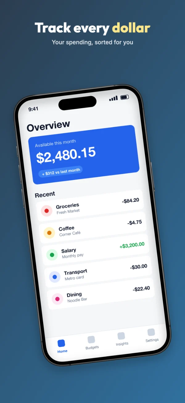
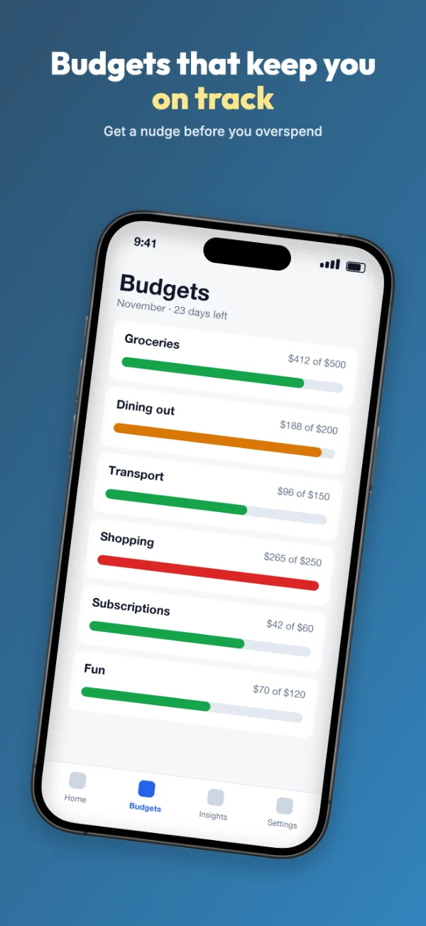
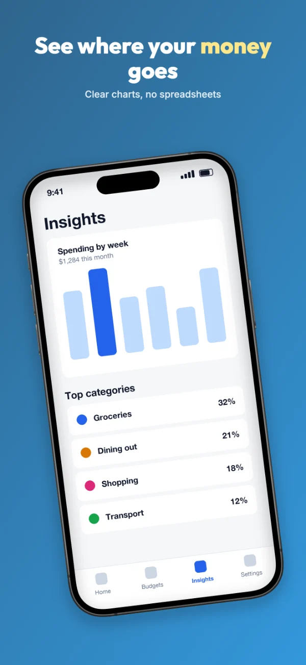
1. Design for the first look
In App Store search results on iPhone, people usually see your first three portrait screenshots next to your app's name and icon. On Google Play, the first few appear when someone opens your listing. Many people never swipe further.
That means your first two or three slides have to do most of the work on their own. Put the main reason to download the app on slide 1, not a welcome screen or a logo.
2. Write headlines that describe a benefit
A screenshot headline has about a second to land. The ones that work describe what the person gets, not what the feature is called.
| Instead of… | Try… | Why |
|---|---|---|
| Advanced budgeting engine | Budgets that keep you on track | Says what the user gets |
| Cloud sync functionality | Your notes on every device | Concrete and short |
| Powerful analytics dashboard | See where your money goes | Answers a question people already have |
| Welcome to the app! | Plan a week of meals in 5 minutes | A specific result beats a greeting |
A few rules of thumb:
- Three to six words. If it needs two lines at a normal size, it's probably too long.
- One idea per slide. If a headline has "and" in it, split it into two slides.
- Highlight one word. Coloring the most important word gives the eye a place to land. Highlighting several words cancels the effect.
- Use the smaller line for detail. The second line is optional. Use it for a supporting fact, not a repeat of the headline.
For a step-by-step method and 40 more examples, see how to write screenshot headlines.
3. Put the slides in a deliberate order
Think of the set as a short story rather than a feature list. An order that works for most apps:
- The main benefit, the reason the app exists.
- The core action, what people do most often in the app.
- The result, what they get after using it for a while (progress, insights, saved time).
- What makes it different from the alternatives.
- Trust: privacy, offline use, ratings or awards, if you have them.
Four to six slides is plenty for most apps. Google Play wants at least four for featured placement. Apple allows up to ten, but slides seven to ten are rarely seen.
4. Show the real app
Apple's App Review Guidelines (section 2.3.3) say screenshots should show the app in use, not just title art, a login page or a splash screen. Google Play has similar rules against misleading graphics. Beyond the rules, real screens build trust: people can see what they're getting.
- Capture screens with realistic data. Empty states and "Lorem ipsum" make an app look unfinished.
- Clean up the status bar. In the iOS Simulator you can set a tidy time and full battery with
xcrun simctl status_bar booted override --time 9:41 --batteryLevel 100. Our clean screenshots guide has the full set of commands for iOS and Android. - Crop nothing important. The Studio fills the phone's screen and trims the edges slightly if your capture's shape differs from the frame's.
5. Choose colors that match your brand and stay readable
Use one or two colors from your app icon for the backgrounds so the set feels like part of the same product. A few practical points:
- Keep the background behind text simple. White text on a busy gradient becomes hard to read at small sizes. Check your set at the size it appears in search results, about 1/10 of full size.
- Make the highlight color stand apart. It needs to contrast with both the background and the main text color.
- Use a continuous background if you want people to swipe. When the gradient flows from one slide into the next, the set reads as one image and invites scrolling. The Studio's "One background flowing across all slides" option does this.
- Stay consistent. Same font, same phone position, same text placement on every slide. Variety should come from the app screens, not the layout.
6. Translate for your biggest markets
Both stores let you upload different screenshots per language. If a meaningful share of your downloads comes from one non-English market, translating the headlines (and capturing the app in that language) is often the cheapest improvement you can make. Keep translated headlines short, because many languages run longer than English. Our translation guide walks through the whole process.
7. Test instead of guessing
Both stores have built-in tools for comparing screenshot sets with real visitors:
- App Store: Product Page Optimization in App Store Connect lets you test up to three alternative sets of screenshots against your current page.
- Google Play: Store listing experiments in the Play Console split visitors between your current listing and a variant.
Test one change at a time, such as a new first slide or a different headline, and let the test run until the console reports a clear result. Small changes to slide 1 often matter more than redesigning the whole set.
Checklist before you upload
- Slide 1 states the main benefit in six words or fewer.
- Every slide shows a real screen from the current version of the app.
- One highlighted word per headline, at most.
- Text is readable when the image is shrunk to search-result size.
- The sizes match the store's requirements. See the screenshot sizes guide.
- Files are PNG or JPEG with no transparency, numbered in upload order.